+LOGO
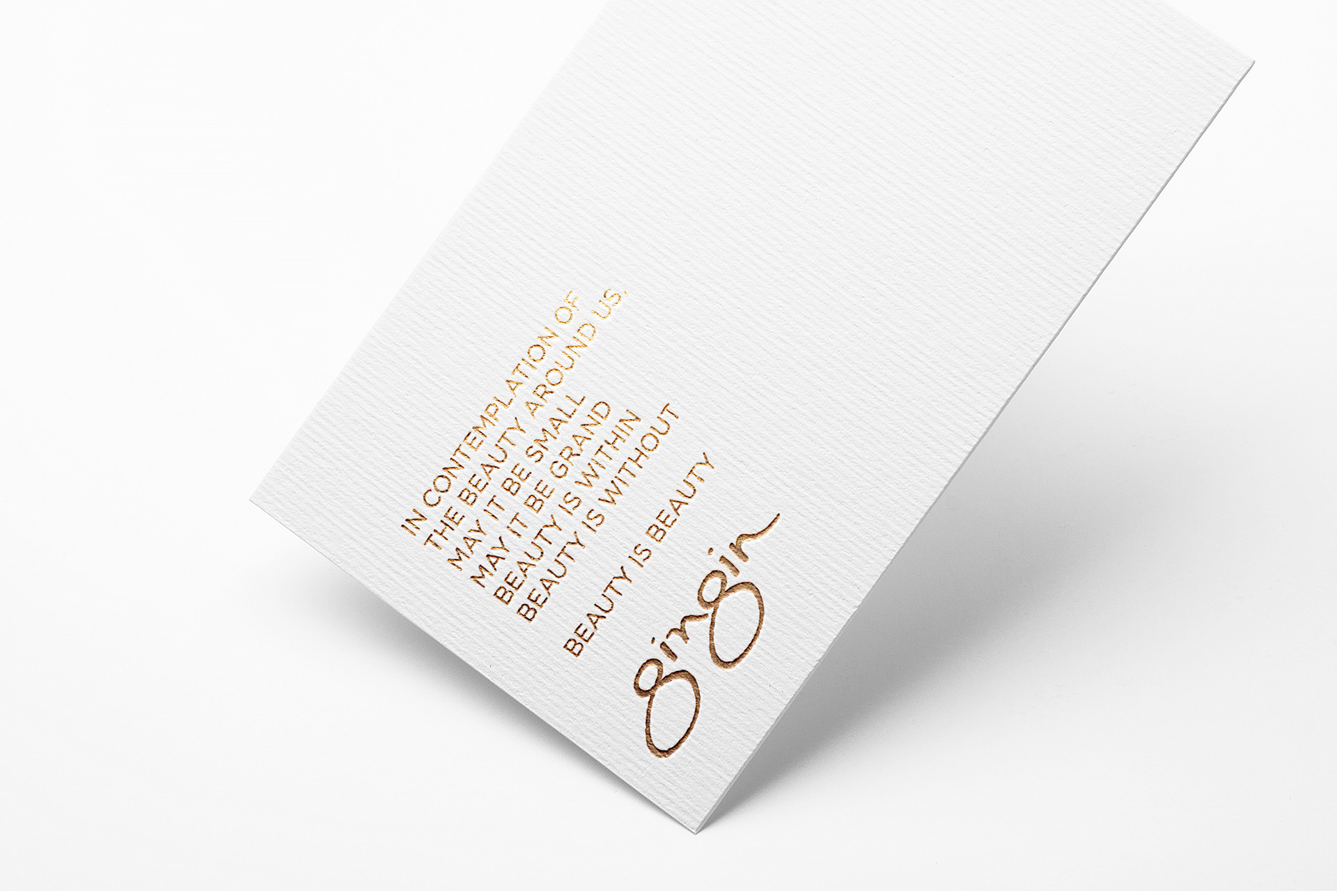
GINGIN
LOGO + ALTERNATIVE LOGO

GINGIN is a luxury company that curates collections by featured artisans from around the world. When creating this logo, their founder was advised by an astrologer to incorporate the Chinese character, 晶, which is used to describe something that is brilliant and shining. For some background, this character is comprised of three suns, attributing to the intensity of its brightness. In addition to her astrologer's choice of character, I designed each of the three suns to resemble the number eight. In Chinese culture, the number eight is considered to be lucky and is associated with wealth and prosperity, so hopefully this will triple her success! To tie everything together, I was inspired by the symmetry of chop block stamps, which are used to sign documents in Asia, and we of course chose the color gold, another element that adds to this character's brilliance and luck.
For GINGIN's secondary logo, I was inspired by the flow of Chinese calligraphy and was able to again incorporate the number eight (twice).
These logos were so fun to design, and I'm sure that they'll boost GINGIN's success!
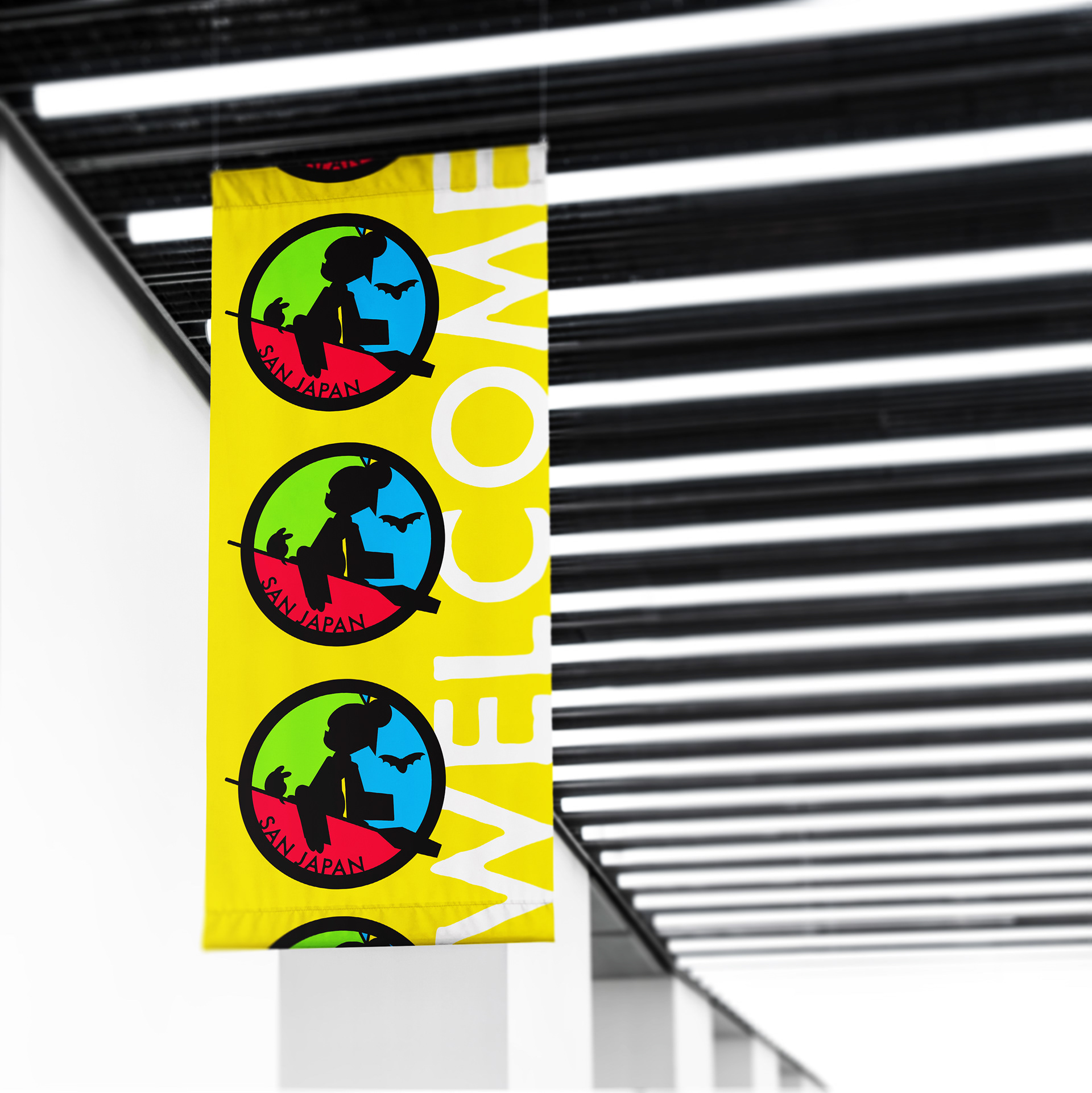
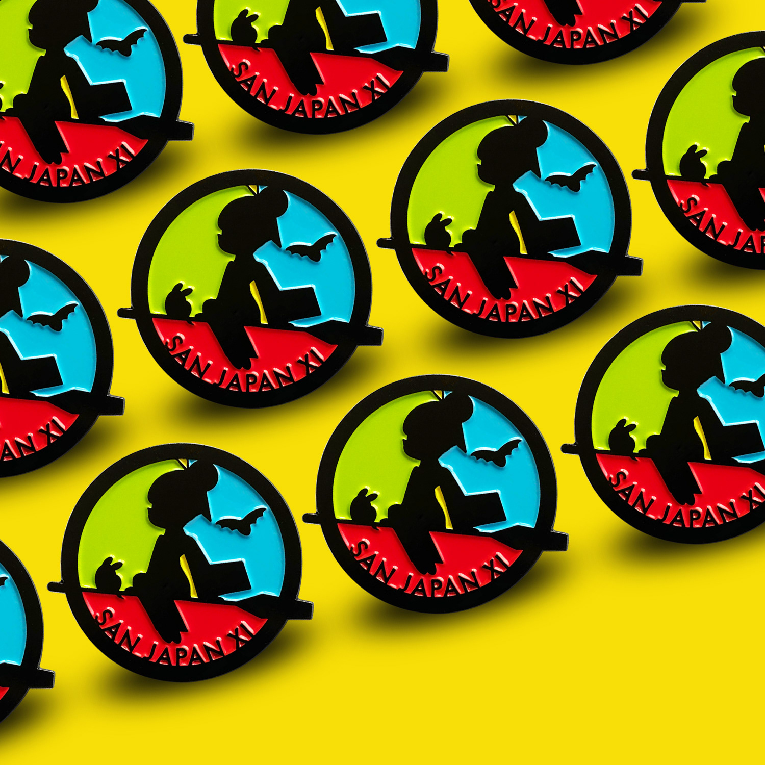
SAN JAPAN
ALTERNATIVE LOGO/ PIN DESIGN/ SHIRT DESIGN
San Japan is the largest annual anime and gaming convention in South Texas, hosting over 20,000 attendees during Labor Day weekend. I originally submitted my work as a T-shirt design, but it later transformed into an enamel pin and then into San Japan's secondary logo.
The convention theme the year I submitted was "magical girls," which is a popular anime genre. My design is heavily inspired by Hayao Miyazaki's Kiki's Delivery Service, and Yoshihiro Togashi's character, Botan. I also incorporated San Japan's colors and mascots.
I always look forward to making my trip down to San Antonio for the convention, and am stoked that my work gets to be a part of the show!